Home

Sample designs.

Every business gets its own layout, type and colors, chosen around the first thing its customers want to do. These four show the range.

01

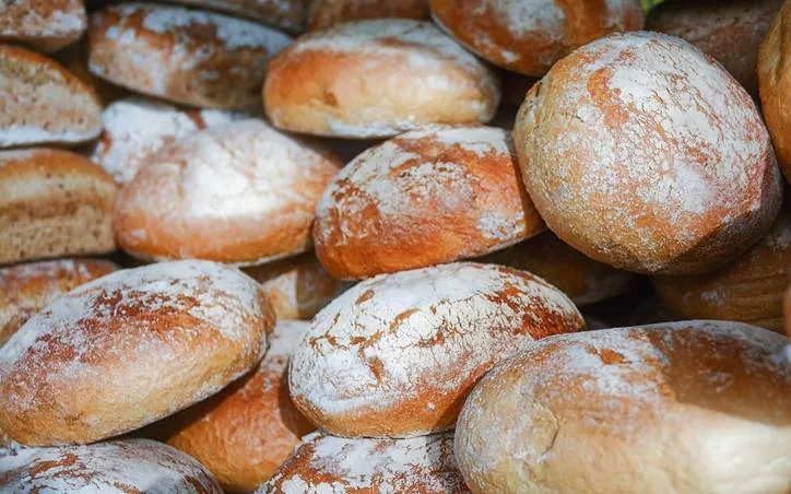
Rise Bakery

Centered and editorial, menu with prices up front

A bakery sells what came out of the oven today, so the menu and prices sit on the first screen. A classic serif on a dark crust-colored background with a warm tan accent feels like the shop. The one main action is ordering for pickup.

02

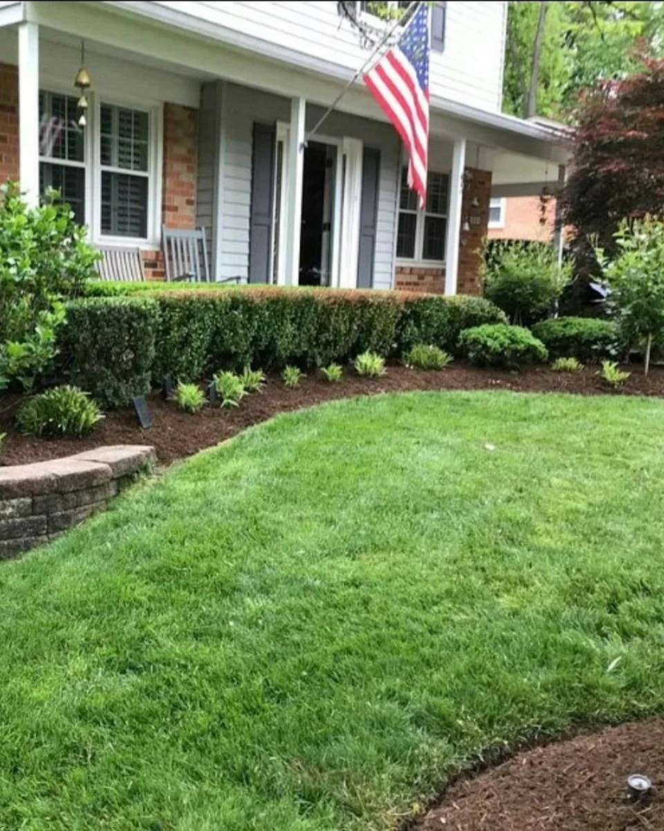
Greenline Landscaping

Split screen, estimate form on the first screen

Landscaping customers want a price, so the estimate form sits beside the headline. Tall condensed type and a deep green with a bright lime make it feel like outdoor work. The one main action is sending an estimate request.

03

Bright Smile Dental

Bright and friendly, online booking and service cards

Patients want to know if they can get in soon, so the next opening and a booking button come first. A soft teal and rounded shapes keep it calm. Services sit in simple cards underneath.

04

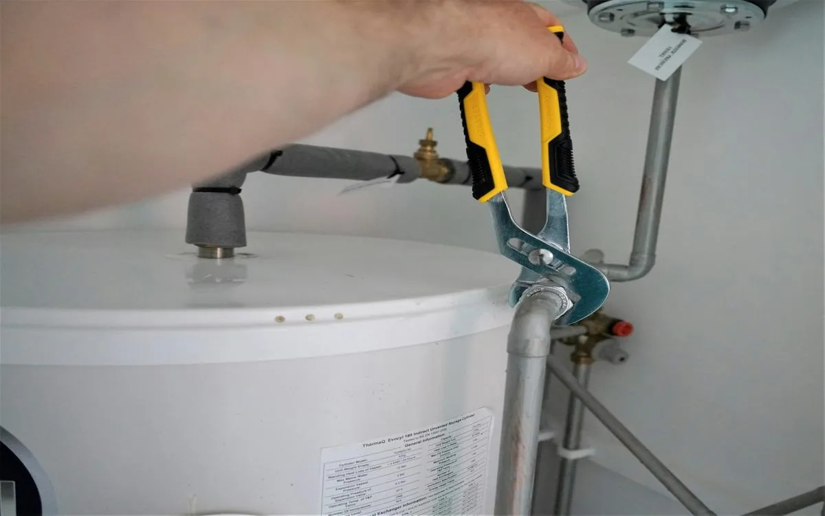
Harlow Plumbing

Full photo, one big call button for emergencies

Someone with a burst pipe needs a phone number, fast. A full photo, heavy type and one large call button do that job. Services run along the bottom for the non emergency visits.

Want to see yours?

Within 24 hours you get a grade for phones, speed and Google, plus your homepage rebuilt so you can compare.

We only email you about your review. Unsubscribe anytime.

Request received

We’re reviewing yoursite.com. Here’s what happens next.

  1. NowYour request is in the queue

    Nothing else needed from you.

  2. Within 24 hoursYour review arrives

    Sent to your email: a grade for phones, speed and Google, plus your rebuilt homepage.

  3. ThenYou decide

    Like it? Pick a plan. If not, you owe nothing.